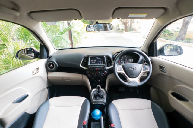
Getting in, the Santro Sportz AMT variant we have here gets a normal key with keyless entry buttons and central locking. Even when getting in, the large front doors feel solid and shut with a rather reassuring thud. The door-handles, however, are similar to the ones on the old Santro and could have been a different design. No complaints really.
The Korean carmakers have aced the interior department when it comes to quality components and levels of fit-and-finish, and, in the compact classes, have raised the bar without a shadow of a doubt. The Santro is no different. The quality of the interior plastics on the centre console, dashboard and door panels feel robust and built to last. Even in this second-from-top Sportz variant, the Santro gets a pleasant cabin. The dual-tone beige-black upholstery makes for a spacious feel. That’s also thanks to the layout that seems to have opened up every bit of available space for use. There’s a smart information display behind the wheel and the centre console starts with an easy-to-use 7.0-inch touchscreen. There is connectivity via Bluetooth, USB and a choice of Android Auto, Apple CarPlay or MirrorLink. With the four-speaker set-up and the easy to navigate touch-screen interface, going though music is easy and the steering-mounted controls make it easy on the move, too.
Also on the centre console are the climate control knobs and switches are manually operable. There is a neat centre storage unit which coddles anything placed in well. The AMT gear-lever feels premium and also offers a manual option to shift up and down. Below that are the window controls. It’s been done before and it’s unconventional, yes, but not really inconvenient. All four doors have door pockets which have bottle holders and ample space for other slimmer items. Apart from all the usable storage, there’s also a little trash-can which is useful for disposing off wrappers and such. Even rear passengers get a pair of air-vents and the boot volume behind the rear seat-back is a decent 235 litres.
However, things aren’t all rosy. The steering wheel is fixed and non-adjustable. The seating is quite high and taller than average drivers will find the seating position a little awkward at first, but not uncomfortable. The seat-belt position too makes it difficult to get a hold of the actual belt when you get in and I fumbled for it every time. It’s also minus the pretensioner and load-limiter, which are only in the Asta variant. The head-rests are fixed, front and rear. While the front is just about tall enough, the rear ones are low and tall passengers will tend to be uncomfortable; with the limited rear knee-room adding to that thought.
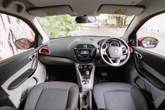
The Tiago XZA gets a folding key-fob and central locking. Get in and the design is pleasing and looks modern, thanks to the colour-coordinated accents, but the levels of fit-and-finish aren’t like that of the Santro. The cabin has a functional layout and the controls are traditional and well-placed. The Tiago XZA also doesn’t get a touchscreen, instead making do with a 2.5-inch display that is accompanied by a bunch of buttons; old-school, not complaining. It makes up with the ConnectNext infotainment from Harman with an eight-speaker sound system, Bluetooth, USB and Aux connectivity. Steering-mounted controls are present here, too. The glovebox, meanwhile, can fit a tab, and also has a cooling function.
The driver’s seat is easily adjusted and is height-adjustable as well. There’s also the inclusion of dual front airbags, speed-dependent door-locks, ABS with EBD and corner stability control as well as seat-belts with pretensioners and load-limiters. Rear space and seating is comfortable too, and the boot volume is slightly more than the Santro’s at 242 litres.
The quality of plastic, though, is not as good as that in the Santro. Be it the feel of the steering wheel, the centre stack, the dashboard and, especially, the now seemingly crude finish on the lower portion of centre console near the hand-brake lever and storage area. Speaking of which, the storage, too, could have been a little less specific and more generic to allow for more flexible application. Not everyone stores the same kind of things in the car in the same place. In the pursuit of including all the little details, the big picture seems to have gone a bit awry. Then again, these bits are not really deal-breakers, just areas of potential improvement.







Leave a Reply